A look at color photography:
by Wolfgang Hock
The reproductions below are no diversion and no illustration, they are examplification and visualisation of my threads, clarifying my text. Without those images - only by words - would be impossible to carry it out because it's about the history of seeing.
The color photography starts spreading worldwide only from 1937 and in the 40's and 50's of the twentieth century, launched by Kodak and Agfa almost at the same time. So the chemical color photography survived only 70 years, a very short period compared to that of projected lense image.
The desire taking colored photographs is as old as the photography itself. Already one of the inventors of chemical photography, Joseph N. Nièpce (1765 - 1833), regretted the impotence to produce colored pictures.
The answer to the problem was painting on black and white photographs; a technique which fed still many painters later.
Only with the invention of the brothers Lumière, color photography started to be interesting because their autochrome sheets, launched in 1903, were produced industrially.
But with the invention of the thin multilayer color reversal films by Kodak and Agfa from the year 1937, started the worldwide prevalence of the color photography.
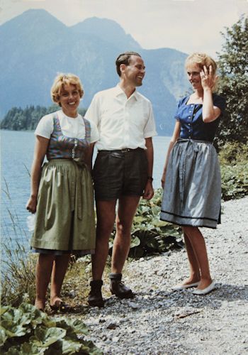
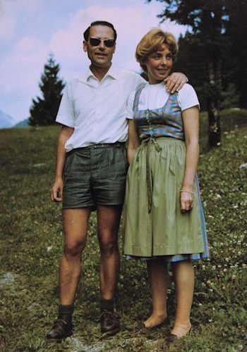
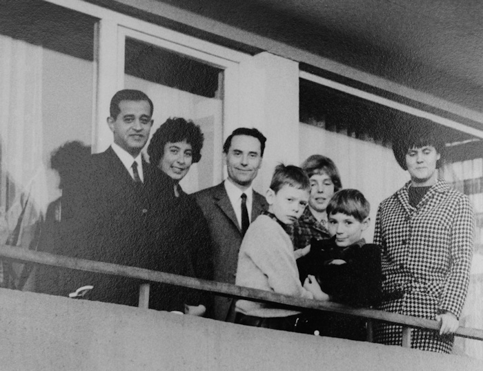
Color photography from 1965,
still very different from the digital photography today ...
Color photography by: Wolfgang Pöppinghaus 1965
(The persons: My mother, my father and Karin Pöppinghaus)
Till far in the fifties, there was no good printing of color photography in books, magazines, catalogues, posters etc.
It was possible to reproduce black-and-white photography very well, but color photography not yet. People were crazy for these supposedly “real” pictures, the “colorful” pictures, how they were called at that time, "with absolutly faithful color reproduction".
Black-and-white photography was just regarded as antiquated again …
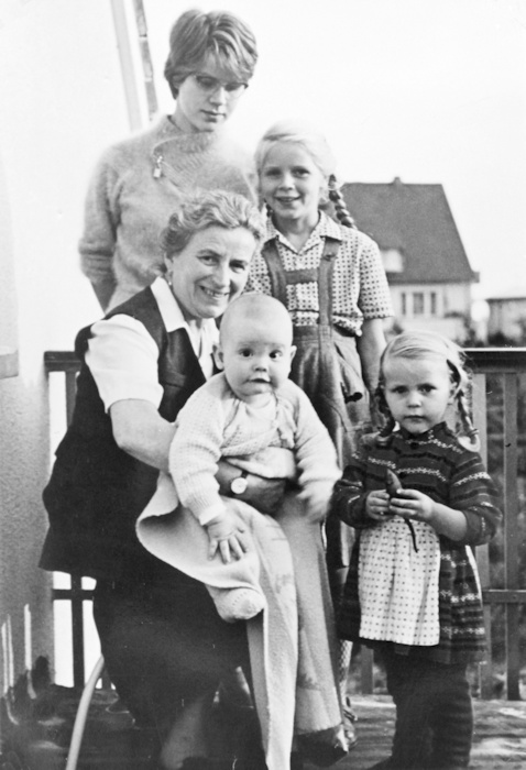
(The Persons: The HOCK family, the baby, it's me!)
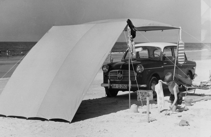
Examples for black-and-white-photography from 1957
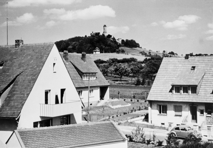
(The persons: The Klavitz family from Egypt, my parents, Helmut und me)
Examples for black-and-white-photography at the beginning of the sixties
Who could afford did not take any more black-and-white-photographies, they were out qickly. Now it was the time to publish color images also in modern books and mags.
That’s the reason why at that time – not so long ago actually – a crowd of ‘photo-painters’, mostly called ‘illustrators’, worked for the newspaper and magazine publishers and did nothing more than copy by hand photos ‘truly-to-life’ and ‘colorfully’, to be reproduced after that in the publications again on photo-base.
Here an example from the fifties:
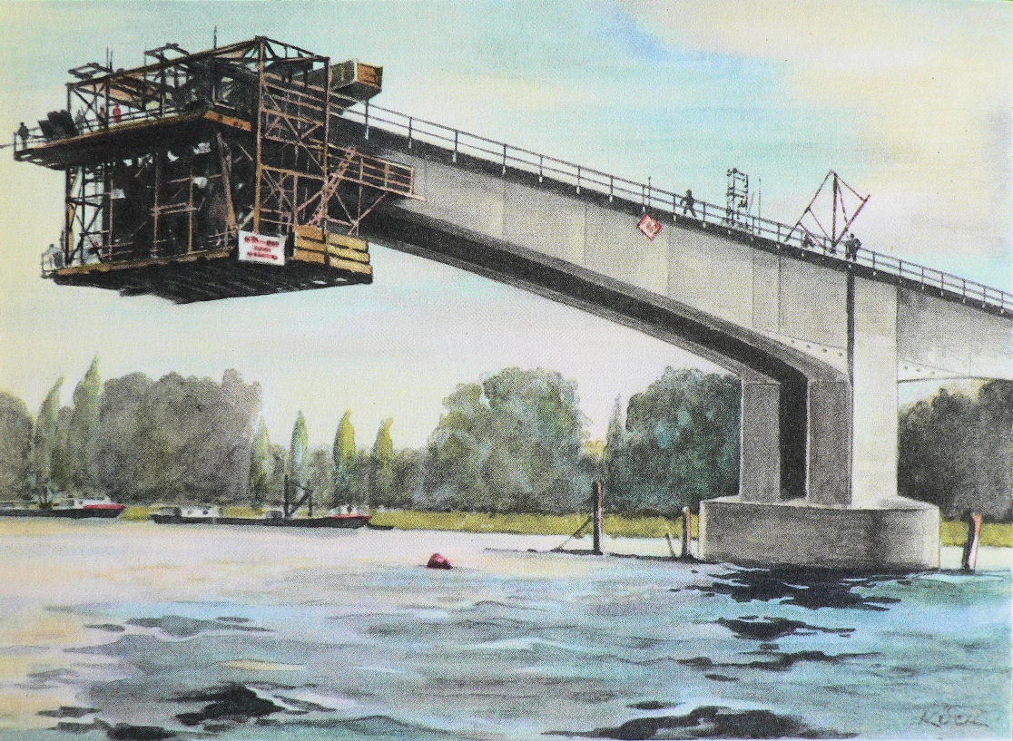
Concrete bridge in Worms (bridge of the Nibelungen) by Dyckerhoff & Widmann
so-called
"drawing" by Fritz Kück 1954
from: Westermanns Monatshefte, Chefredakteur Hermann Boeckhoff, Braunschweig 1954,
Jahrgang 1954, Heft 1, p. 28.
Actually a really complicated and cumbersome process: From a black-and-white-photo was made a colored painting by hand and therefrom was made a colored photo again, to reproduce it in high editions.
The public didn’t notice that at all – as always: The main thing was colorful and true-to-life pictures. By the way, everything as today …
Only by the time distance, we recognize today those pictures neither strongly colored nor true-to-life really. And who doesn’t look at them exactly again today, will see only one thing: Everything quite old-fogyish !
The “drawings” – how they were called at that time – by Fritz Kück from 1954 are those colorful hand-painted documentary photos to escape the ‘antiquated’ black-and-white.
At this case, the name of the painter was still mentioned at least; mostly everything about the authorship was kept quiet absolutely camouflaging the production process.
Would have people thought about this all, the term of documentation would have got into a scrape. But ‘colorful’ was at that time more important than black-and-white documentary photography, seen not any more as ‘true-to-life’ and because of this as out-dated.
But at that time this all wasn’t old-fogyish at all, it was the same as we hold the dernier cri today, for example giant-sized digital photography.
What changed is our way of seeing. We guess today, digital photography is true-to-life, is real, exactly the same perception of those pictures at that time !
After 30 years people will hold old-fogyish all this ‘true-to-life’ of today just as we hold those pictures from the fifties.
I believe only if you conceive this radically and comprehensively, you can understand really what means seeing, what is art, what is consciousness and so you can protect yourself against manipulation in all your way of thinking and behavior. Here is the possibility to freedom and self-realization. And this is something what is threatened always and in all times by many things, especially by the visual on tv and the so-called "media". The conceptual by words comes later, is deduced from the visual.
All in opposition to what is communicated to us every day ‘officially’ – till this day (on tv, in the internet, daily press, mags etc.).
In the advertising industry there was working a still bigger crowd of photo painters. Here are two examples from the early sixties. The first represents a free translation from a photograph, the second is a copy with strong idealisation:
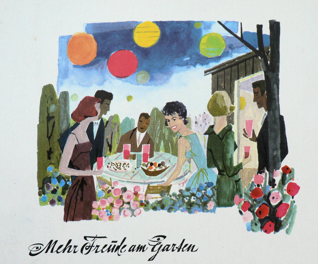
"More fun with the garden"
Advertisement for BOSCH household aids from 1960
Image by the Bosch-commercial artist with the code HM 7 60
"BOSCH household aids provide the housewife the often desired leisure time and help also her to have more fun with the garden"
from: Westermanns Monatshefte, Chefredakteur Hermann Boeckhoff, Braunschweig 1960, Jahrgang 1960,
Heft 5, p. 138 (back coverpage)
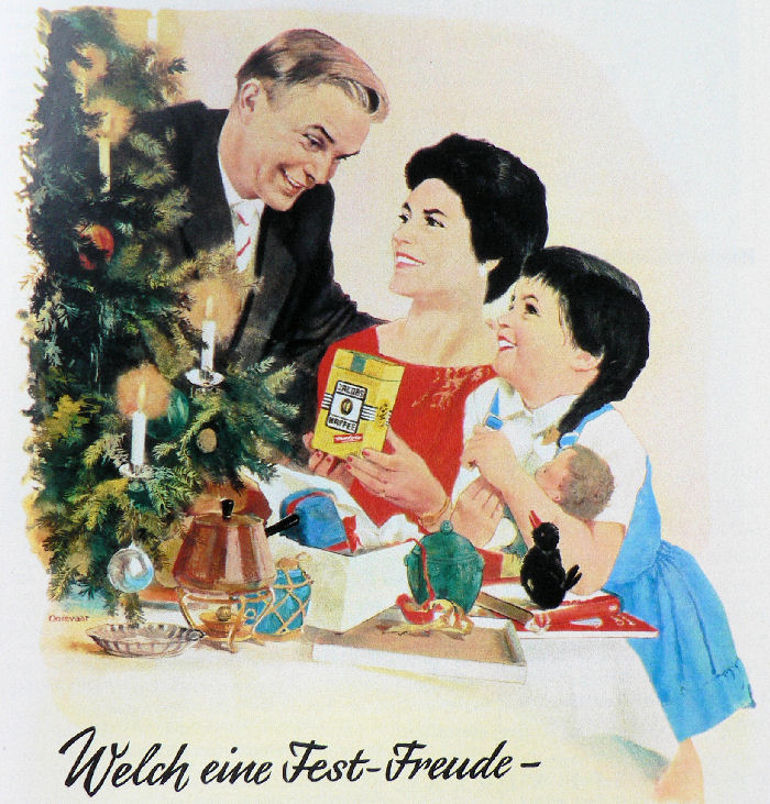
"What a celebration - happiness - "
Coffee-ad from the fifties (Jacobs Kaffee)
Painted by Ooievaar 1961
from: Westermanns Monatshefte, Chefredakteur Hermann Boeckhoff, Braunschweig 1961, Jahrgang 1961,
Heft 12, p. 99.
Today in advertisement is worked very much with photoshop to get glamorized ("perfect") images as well, but we don't notice it again. When we watch those old pictures from that time, we can't understand that no one didn't see that.
Now some examples of travel photography (report) from that time:
The following color photographs weren’t painted any more, only retouched. You can see at the photo from Arabia many parts retraced, especially the plants. Now the color photography had come definitely to the publications.
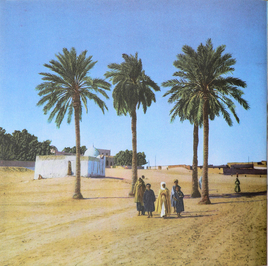
The tomb of a Marabut at the street to Touggourt
Color photography by Maywald
from: Westermanns Monatshefte, Chefredakteur Hermann Boeckhoff, Braunschweig 1954, Jahrgang 1954,
Heft 9, p. 60.
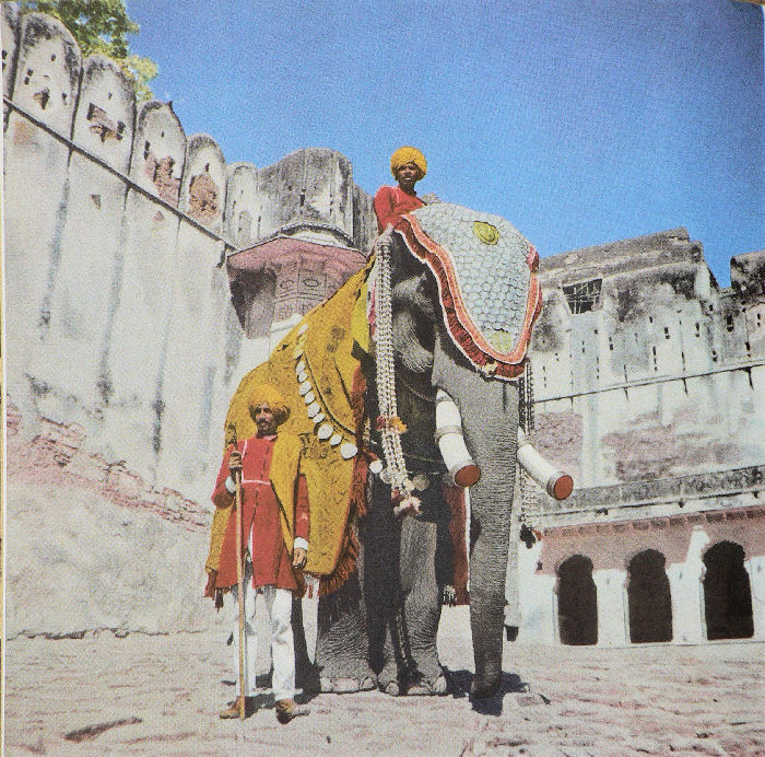
"India - Radschputana - Country of Knights "
Richly blazoned state elephant in the court of the Bundi palace
Picture by Ludwig Alsdorf 1955
from: Westermanns Monatshefte, Chefredakteur Hermann Boeckhoff, Braunschweig 1955, Jahrgang 1955,
Heft 6, p. 26.
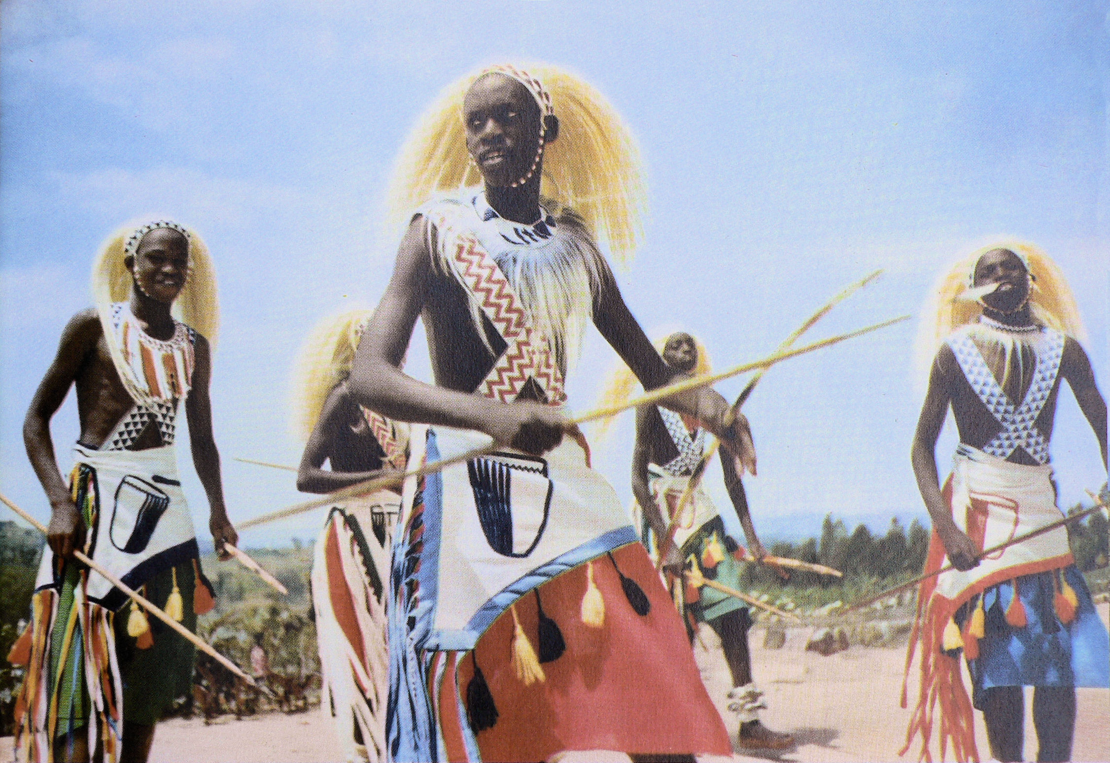
"Young Watussi dancers. They carry white wigs with long braids of monkey hair and pearl bands.”
Color photography by Covello / Black Star
from: Westermanns Monatshefte, Chefredakteur Hermann Boeckhoff, Braunschweig 1958, Jahrgang 1958,
Heft 2, p. 31.
These were those pictures we can watch today e.g. in the “GEO” magazine in digital manner. But the pictures from that time don’t appear to us today any more true-to-life and photographic, much more painted, especially the colors appear more pastel for us today. But at that time this was loud and colorful, exactly what everybody wished to see: Strange exotic cultures, so-called "primitive peoples" in high tech.
Basically as today, isn’t it ?
Today we see those pictures from that time not as ‘really’, we realize the medium. But we see this at the digital high tech pictures of today in the newspapers, giant posters, magazines and in the internet ? Again we think this is real – all the same at those times. Everything comes up over and over again …
Here still two examples from the early sixties:
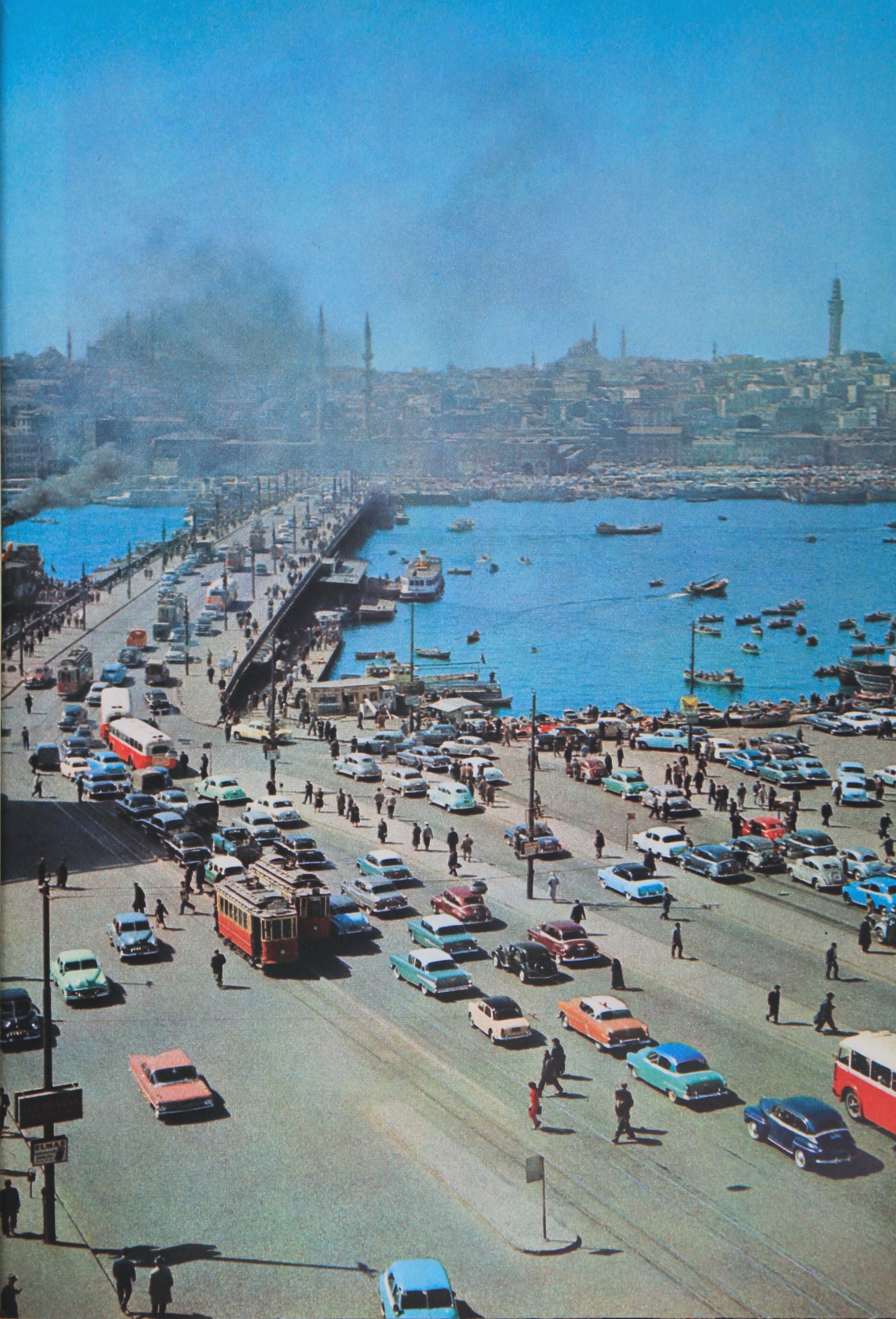
Galata-bridge in Istanbul
Color photography by Rosmarie Pierer 1962
from: Westermanns Monatshefte, Chefredakteur Hermann Boeckhoff, Braunschweig 1962, Jahrgang 1962,
Heft 4, p. 11.
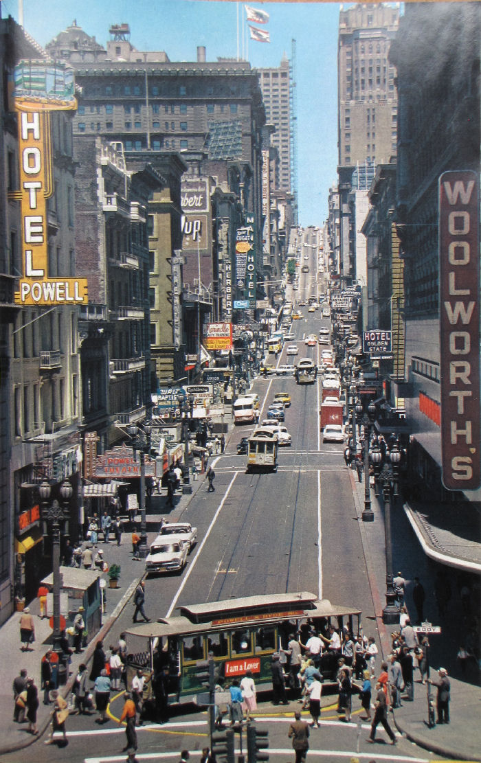
San Francisco: Powell Street
Color photography by Heinz Duddeck 1962
from: Westermanns Monatshefte, Chefredakteur Hermann Boeckhoff, Braunschweig 1963, Jahrgang 1963,
Heft 7, p. 37.
And then came the television - the moving reality from outside - inside the living rooms, but first in black-and-white again:
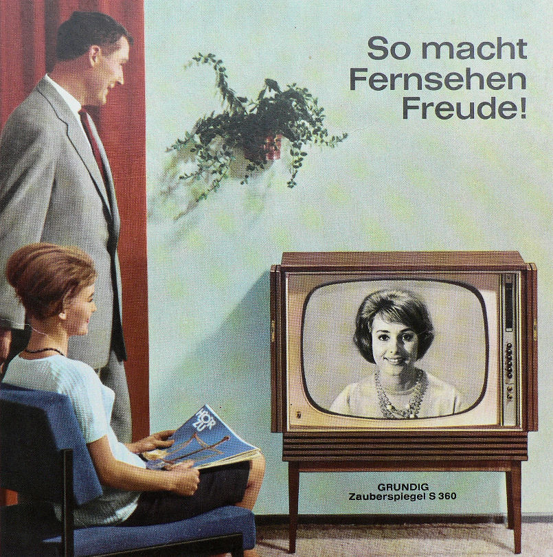
"This way tv makes fun"
“Grundig magic mirror”, colorful ad from 1963
Picture by the Grundig-commercial artist with the code S 360
from: Westermanns Monatshefte, Chefredakteur Hermann Boeckhoff, Braunschweig 1963, Jahrgang 1963,
Heft 12, p. 119.
It was really magic: The ‘reality’ in the living room, at that time still in black-and-white. But with a display screen size of 69 cm, it was more real than reality…
The reproductions are no diversion and no illustration, they are examplification and visualisation of my threads, clarifying my text. Without those images - only by words - would be impossible to carry it out because it's about the history of seeing.
ALL IMAGES AND SITE CONTENT © WOLFGANG HOCK